Put on your Platypi face! How a Brisbane designer’s typeface went global
They’re part of our everyday lives yet you can be forgiven for not thinking too much about typefaces and fonts – until now, as a talented Brisbane designer has created a new one with an Aussie twist.
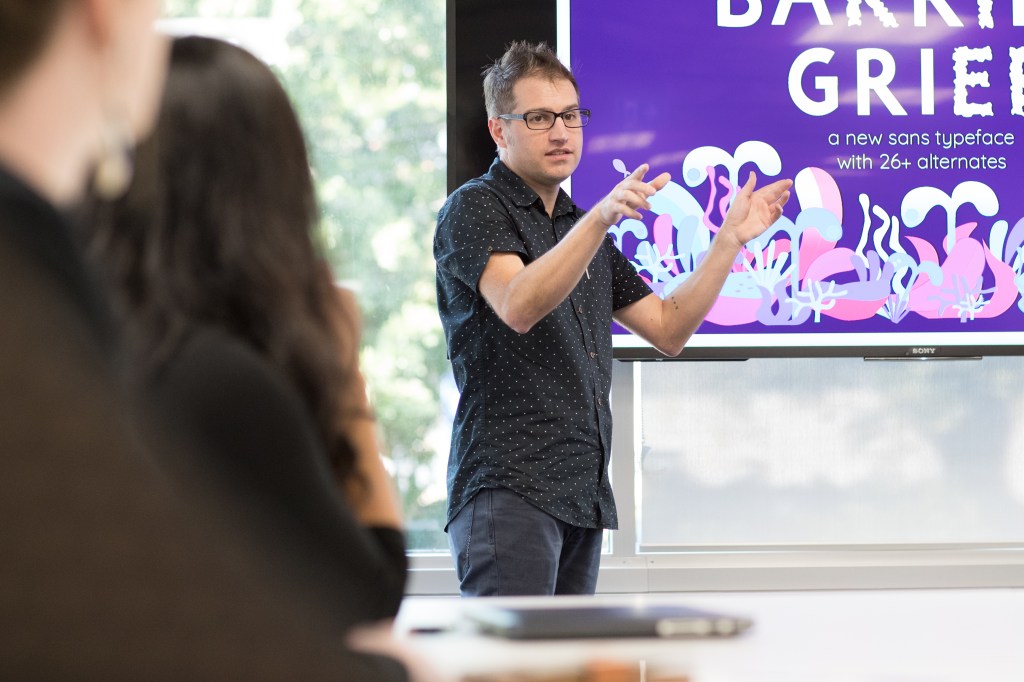
When designing a new typeface, the magic word is “handgloves”. “That covers everything,” David Sargent explains. “You have diagonal lines, you’ve got straights, curves and combinations of different things.”
Sargent is the Brisbane-based creator of a new antipodean typeface known as Platypi. Launched on Google Fonts in 2022, Platypi consumed “every night and every weekend” of Sargent’s calendar for 18 months.
Since 2009, Sargent has taught at the Queensland College of Art and Design, where he is the creative director of Liveworm – a design studio staffed by students. Last year, Sargent and his Griffith University colleagues hosted the world’s premier typography conference, ATypl, in Brisbane. It was the first time the event had been held in Australia.
Typeface design has fascinated Sargent since his school days, when the budding artist would scrawl the distinctive lettering of the Guns N’ Roses logo over his pencil case and bag.
“Typeface design is important because it adds so much to the communication of the written word,” Sargent says. “The meaning of what you’re reading can be emphasised or changed, or emotion could be added to it, or the choice of font may make it easier to read, which is really important in lots of different situations.”
While “typeface” and “font” are often used interchangeably, they each have a distinct meaning. A typeface refers to the design of a complete set of characters, while font specifies a particular weight or style within the typeface.
You might like
The world’s premier type design studios, known as “foundries”, are clustered in the northern hemisphere. Before the COVID-19 shutdown, Sargent had engaged respected Australian typeface designer Troy Leinster to deliver workshops in OZ while he was visiting from New York. These became online classes held on Saturday mornings during the pandemic.
Following those introductory sessions, Sargent decided to apply for one of the field’s top training programs, run by the Letterform Archive in San Francisco.
“To learn type design formally, (previously) you’d have to travel to San Francisco or New York, Paris, or the UK or the Netherlands,” Sargent says. “There were only these very small, exclusive type design schools. You had to upend your life and travel there to study. With COVID, a lot of those places switched to online for the first time.”
Sargent completed his postgraduate certificate in type design remotely, with Platypi the focus of his final project. He was the sole Australian in the cohort and wanted his creation to reflect that.
It was this idea of trying to jam those things together that don’t usually work well together
“The typeface is a bit of an experiment – it’s got really angular-triangular barbs or serifs – but it combines that with really smooth and flowing lines,” he says. “ So it was this idea of trying to jam those things together that don’t usually work well together. And the platypus is very much like that.”
Subscribe for updates
Serif typefaces, such as Platypi, have decorative lines attached to the beginnings and ends of the letters, sometimes known as “feet” or “tails”. Sans serif typefaces lack these embellishments.
Many typefaces still in use today were designed by hand a very long time ago. Sargent’s favourites include Akzidenz-Grotesk, a sans serif German typeface released in 1898. The sans serif typeface Helvetica, which is ubiquitous in the design world, was launched in 1957 and was the focus of a documentary released in 2007 to coincide with its 50th anniversary. Popular serif typefaces include Garamond, Georgia, and Times New Roman, commissioned by The Times in 1931.
Sargent started sketching Platypi with a stylus on his iPad before using the industry standard software, Glyphs. A new typeface requires the creation of hundreds of letters, numbers and characters (including punctuation marks), and each of these requires its own refinement process.
“A letter ‘g’ might look really beautiful on its own, but then when you apply it to a block of text, you see that the ‘g’ might look heavier or out of place in the collection, and then you make changes,” Sargent says. “And when you make changes to that, then the ‘a’ might look out of whack. So it’s pulling these pieces of string all the time.”
While the design of a new typeface remains incredibly time consuming, some modern shortcuts are available. Sargent established the all-important spacing between characters, known as kerning, before using AI to help replicate those measurements at scale.
Platypi has been designed not only for use in English, but also Vietnamese, as Sargent found the distinctive accents of that language appealing.
He also researched the unique characters of Australian indigenous languages to ensure Platypi would be accessible in those languages, too.
To date, Platypi has racked up more than 70 million uses on Google Fonts. Sargent doesn’t receive a cent, as Google Fonts is open source. It’s a way of giving back, Sargent says, as budding type designers rely on these files to hone their craft. It’s a buzz, he admits, to see Platypi “in the wild”.
“It’s really cool,” he says. “You get these random emails from people who say: ‘Oh, I really love the typeface and used it for this’. Someone from Spain sent me an Instagram reel, and they’d used the typeface for an art catalogue.
“I remember the first time I saw it being used was on a YouTube video. I was watching it and I thought, the typeface looks so familiar. It took a little while and then I realised, oh, that’s my typeface.”